Mining Bill Gates’ Tweets Using R
This is a guest post by Preetish Panda.
Twitter has always been a rich source of social data that allows us to perform analysis on wide range of topics. Considering more than 6,000 tweets are posted per second and the open API gives real-time access, twitter data mining has compelling use cases in trend analysis, brand sentiment measurement, and feedback aggregation of new products and services.
In this study, we’re going to extract tweets posted by twitter handle of Bill Gates and perform exploratory analysis along with text mining using `R`.
Extracting data
First off all, we need to create a twitter app that would allow us to fetch required data via Twitter API. Perform the activities given below to get the API key and access token:
- Open up https://apps.twitter.com
- Click on ‘Create New App’
- Enter the details and click on ‘Create your Twitter application’
- Click on ‘Keys and Access Tokens’ tab and copy the following
- API key
- API secret
- Scroll down and click on “Create my access token”
Now we’ll be downloading the data using a `R` library called `rtweet`. Use the code given below to proceed:
install.packages(“rtweet”)
library(“rtweet”)
# the name of the twitter app created by you
appname <- “data-mining”
# api key (example below is not a real key)
key <- “9XmBioEwLudadLryeIeqWERt”
# api secret (example below is not real)
secret <- “uSzkAOXnNpSDsaDAaDDDSddsA6Cukfds8a3tRtSG”
# create token named “twitter_token”
twitter_token <- create_token(
app = appname,
consumer_key = key,
consumer_secret = secret)
#Downloading the maximum permissible tweets and storing it as a data frame
bg_tweets <- get_timeline(“BillGates”, n = 3200)
Exploratory analysis
The next step for us will be to perform exploratory analysis in which we’ll find out the following:
- Number of tweets posted over the years
- Tweeting pattern over the months
- Tweets posted over the days of a week
- Tweet density over the time of the day
- Re-tweets and original tweets
1. Number of tweets posted over the years
We’ll be using `ggplot2` and `lubridate` package to create charts and work with the dates. Let’s now install and load the packages:
install.packages(“ggplot2”)
install.packages(“lubridate”)
library(“ggplot2”)
library(“lubridate”)
Given below is the code to plot the count of tweets over the years by breaking down into months:
ggplot(data = bg_tweets,
aes(month(created_at, label=TRUE, abbr=TRUE),
group=factor(year(created_at)), color=factor(year(created_at))))+
geom_line(stat=“count”) +
geom_point(stat=“count”) +
labs(x=“Month”, colour=“Year”) +
xlab(“Month”) + ylab(“Number of tweets”) +
theme_minimal()
This gives us the following chart:
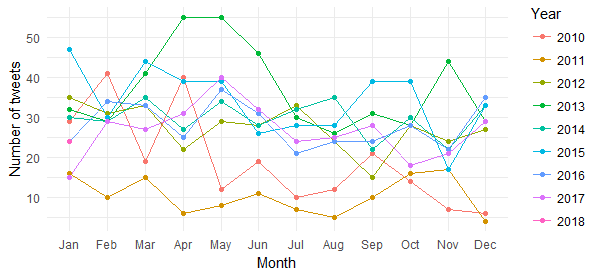
Although this chart gives us the break up of tweets (with April and May 2013 standing out), it is difficult to derive any insight related to tweets posted over the years. Let’s now get that sorted by the following chart:
ggplot(data = bg_tweets, aes(x = year(created_at))) +
  geom_bar(aes(fill = ..count..)) +
  xlab("Year") + ylab("Number of tweets") +
  scale_x_continuous (breaks = c(2010:2018)) +
  theme_minimal() +
  scale_fill_gradient(low = "turquoise3", high = "darkgreen")
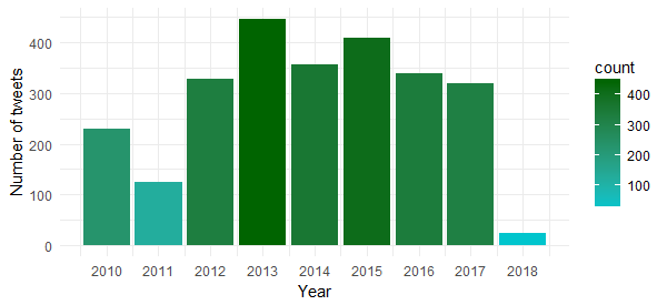
The chart shows that the highest number of tweets were posted in 2013, followed by 2015 and 2014.
2. Tweeting pattern over the months
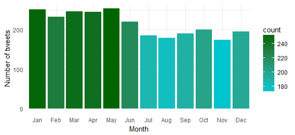
Let’s now understand whether Bill Gates tweets equally over the months of a year or there are any specific months in which he tweets the most. Use the following code to create the chart:
ggplot(data = bg_tweets, aes(x = month(created_at, label = TRUE))) +
geom_bar(aes(fill = ..count..)) +
xlab(“Month”) + ylab(“Number of tweets”) +
theme_minimal() +
scale_fill_gradient(low = “turquoise3”, high = “darkgreen”)
Hmm…it seems he has been more active during the first half of the year. Probably running his campaigns during that time of the year.
3. Tweets posted over the days of a week
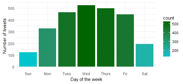
Is there any specific day of the week in which he is most active? Let’s find that out by executing the following code:
ggplot(data = bg_tweets, aes(x = wday(created_at, label = TRUE))) +
geom_bar(aes(fill = ..count..)) +
xlab(“Day of the week”) + ylab(“Number of tweets”) +
theme_minimal() +
scale_fill_gradient(low = “turquoise3”, high = “darkgreen”)
Now we know that he is most active on Wednesday and Thursday. So, better to reach out to him during these days
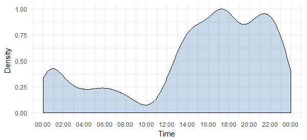
4. Tweet density over the time of the day
Although we know the day, we don’t know the time at which he is most active. The following code will reveal that:
# package to store and format time of the day
install.packages(“hms”)
# package to add time breaks and labels
install.packages(“scales”)
library(“hms”)
library(“scales”)
# Extract time break up only, i.e., hour, minute and second
bg_tweets$time <- hms::hms(second(bg_tweets$created_at),
minute(bg_tweets$created_at),
hour(bg_tweets$created_at))
# Converting to `POSIXct` as ggplot isn’t compatible with `hms`
bg_tweets$time <- as.POSIXct(bg_tweets$time)
ggplot(data = bg_tweets)+
geom_density(aes(x = time, y = ..scaled..),
fill=“steelblue”, alpha=0.3) +
xlab(“Time”) + ylab(“Density”) +
scale_x_datetime(breaks = date_breaks(“2 hours”),
labels = date_format(“%H:%M”)) +
theme_minimal()
This tells us that he is most active during 5-6 p.m. and 9-10 p.m. Note that the timezone is UTC (can be found out using `unclass` function. Keep this in mind while reaching out to him on Twitter.
5. Retweets and original tweets
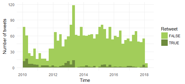
Let’s now compare the number of original tweets and retweets to find out which one has more share. Given below is the code:
ggplot(data = bg_tweets, aes(x = created_at, fill = is_retweet)) +
geom_histogram(bins=48) +
xlab(“Time”) + ylab(“Number of tweets”) +
theme_minimal() +
scale_fill_manual(values = c(“darkolivegreen3”, “darkolivegreen4”), name = “Retweet”)
The chart shows that most of his tweets are original with a small percentage of reweets. Also interesting to see that the number of retweets were higher before mid of 2013.
Text Mining
Now we’ll move to more interesting part of this study — we’ll be performing text mining techniques to find out the following:
- Hashtag frequency
- Word cloud
- Sentiments expressed in the tweets
Let’s start with the analyses.
1. Most frequently used hashtags
The downloaded dataset already has a column containing hashtags; we’ll be using that to find out the top 10 hashtags used by Bill Gates. Given below is the code to create the chart for the hashtags:
# Package to easily work with data frames
install.packages(“dplyr”)
library(“dplyr”)
# Getting the hashtags from the list format
bg_tags_split <- unlist(strsplit(as.character(unlist(bg_tweets$hashtags)),
‘^c\\(|,|”|\\)’))
# Formatting by removing the white spacea
bg_tags <- sapply(bg_tags_split,
function(y) nchar(trimws(y)) > 0 & !is.na(y))
bg_tag_df <- as_data_frame(table(tolower(bg_tags_split[bg_tags])))
bg_tag_df <- bg_tag_df[with(bg_tag_df,order(-n)),]
bg_tag_df <- bg_tag_df[1:10,]
ggplot(bg_tag_df, aes(x = reorder(Var1, -n), y=n)) +
geom_bar(stat=“identity”, fill=“steelblue”)+
theme_minimal() +
xlab(“#Hashtags”) + ylab(“Count”)
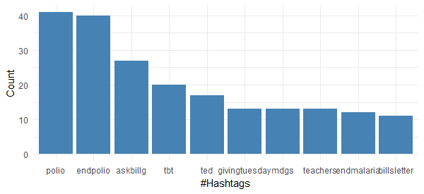
It is very interesting to see that none of top 10 most frequently used hashtags by Bill Gates is associated with technology. It is quite evident that he is highly focused on the philanthropic activities and non-profit campaigns. This chart also tells us that Polio eradication seems to have gotten his maximum attention.
2. Word cloud
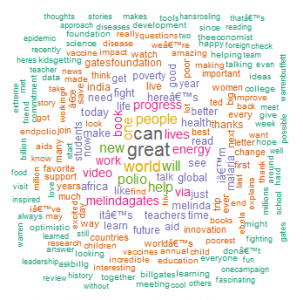
Now we’ll analyze the tweet text to arrive at the most frequent words and create a word cloud. Run the following code to proceed:
#install text mining and word cloud package
install.packages(c("tm", "wordcloud"))
library("tm")
library("wordcloud")

tweet_text <- bg_tweets$text
#Removing numbers, punctuations, links and alphanumeric content
Tweet_text <- gsub('[[:digit:]]+', '', tweet_text)
Tweet_text <- gsub('[[:punct:]]+', '', tweet_text)
Tweet_text <- gsub("http[[:alnum:]]*", "", tweet_text)
Tweet_text <- gsub("([[:alpha:]])\1+", "", tweet_text)

# creating a text corpus
docs <- Corpus(VectorSource(tweet_text))
# converting the encoding to UTF-8 to handle funny characters
docs <- tm_map(docs, function(x) iconv(enc2utf8(x), sub = "byte"))
# Converting the text to lower case
docs <- tm_map(docs, content_transformer(tolower))
# Removing english common stopwords
docs <- tm_map(docs, removeWords, stopwords("english"))
# Removing stopwords specified by us as a character vector
docs <- tm_map(docs, removeWords, c("amp"))
# creating term document matrix
tdm <- TermDocumentMatrix(docs)
# defining tdm as matrix
m <- as.matrix(tdm)
# getting word counts in decreasing order
word_freqs <- sort(rowSums(m), decreasing=TRUE)
# creating a data frame with words and their frequencies
bg_wf <- data.frame(word=names(word_freqs), freq=word_freqs)
# plotting word cloud
set.seed(1234)
wordcloud(words = bg_wf$word, freq = bg_wf$freq,
min.freq = 1,scale=c(1.4,.5),
max.words=200, random.order=FALSE, rot.per=0.15,
colors=brewer.pal(8, “Dark2”))
This confirms what we derived earlier from the hashtags — his tweets reflect his philanthropic work, his foundation and his effort to make the world a better place.
3. Sentiment analysis
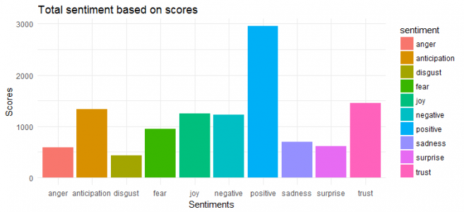
For sentiment extraction and plotting, we’ll be using `syuzhet` package. This package is based on emotion lexicon which maps different words with the various emotions (joy, fear, etc.) and sentiment polarity (positive/negative). We’ll have to calculate the emotion score based on the words present in the tweets and plot the same.
Here is the code:
install.packages(“syuzhet”)
library(syuzhet)
# Converting text to ASCII to tackle strange characters
tweet_text <- iconv(tweet_text, from=“UTF-8”, to=“ASCII”, sub=“”)
# removing retweets
Tweet_text <- gsub(“(RT|via)((?:\\b\\w*@\\w+)+)”,“”,tweet_text)
# removing mentions
Tweet_text <- gsub(“@\\w+”,“”,tweet_text)
Bg_sentiment <- get_nrc_sentiment((tweet_text))
Sentimentscores <- data.frame(colSums(bg_sentiment[,]))
names(sentimentscores) <- “Score”
sentimentscores <- cbind(“sentiment”=rownames(sentimentscores),sentimentscores)
rownames(sentimentscores) <- NULL
ggplot(data=sentimentscores,aes(x=sentiment,y=Score))+
geom_bar(aes(fill=sentiment),stat = “identity”)+
theme(legend.position=“none”)+
xlab(“Sentiments”)+ylab(“Scores”)+
ggtitle(“Total sentiment based on scores”)+
theme_minimal()
We can see that his tweets have largely positive sentiment, and ‘trust’, ‘joy’ and ‘anticipation’ are the top three emotions.
Conclusion
In this study, we covered exploratory data analysis and text mining techniques to understand the tweeting patterns and underlying theme of the tweets. Further analysis can be performed to find out the frequently mentioned twitter user, create network graph and classify the tweets by using topic modeling.

