
Data Visualization Is Mission Critical in Terms of Communicating Effectively to Your Audience
Make no mistake: the world is based on data, we’re just living in it. According to Forbes, data volumes are absolutely exploding – in the past two years alone, more data was created than in all of the previous years that make up human history combined.
As soon as 2020, there will be roughly 1.7 megabytes of new data created for every single person living on Earth every second! This is due largely to the fact that nearly everything you buy is now connected to the Internet – from that big new smart TV to your toaster to your thermostat and everything in between.
Everything is connected, creating and sharing data between them, in an effort to make your life easier.

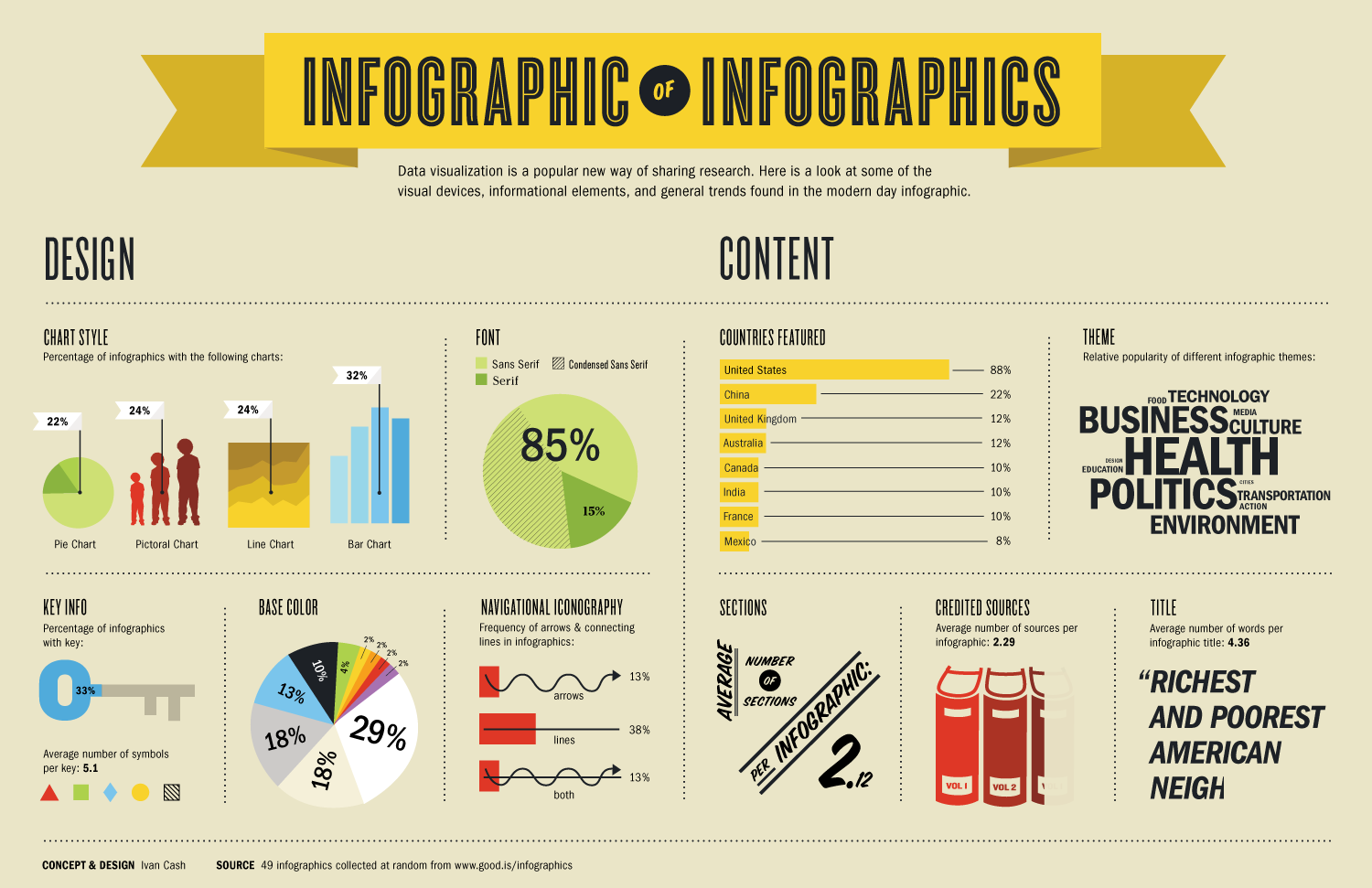
Image source: https://infographiclist.files.wordpress.com/2011/09/infographic.png
Unfortunately, this state of things also brought along a strong side effect: information overload. Data is everywhere and people have a hard time processing it all. According to a study from Texas A&M University, each daily edition of The New York Times now has more information in it than a person living in the 17th century would have processed in their entire lifetime.
This is particularly problematic in the world of marketing, where your ongoing success depends on your ability to essentially take data and get it out to the widest possible audience in the most effective way that you can.
These are just a few of the key reasons why data visualization isn’t just an important concept, but one that will become absolutely mission-critical in terms of communicating effectively to your audience. Data visualization (like Infographics and other storytelling techniques that re-frame your message in an easily digestible, visual way) doesn’t just help you stand out from your competitors and cut to the core of your message, but it also lets you harness the power of visual communication to your advantage.
Data Visualization and Infographics: A Powerful Combination
When it comes to the intersection between data visualization and marketing, it is important to think of each material you create less as a whole story in and of itself and more as one small part of the larger, ongoing story that is your brand. Each piece of collateral you put out into the world doesn’t have to paint the complete picture – but it should have as purpose to unlock yet another piece of a puzzle that people can’t help but want to learn more about.
Infographics in particular, when constructed properly with a tool like Visme at your side, check a lot of important boxes in terms of data visualization effectively, and all at the same time.
For the sake of argument, let’s assume that the data you’ve chosen to present to your audience is valuable – otherwise, you wouldn’t bother broadcasting it in the first place. But people aren’t going to take your word for it – they need more.
Thanks to the deep level of control over the visual design, the color selection, the layout, the font size and color and more, Infographics created with a tool like Visme instantly take ideas that are already valuable and present them in a much more appealing package.
They’re attention-grabbing, too – according to a study conducted by Venngage, a stunning 41.5% of marketers said that original graphics such as Infographics performed better than any other form of visual content.
They’re also responsible for significant benefits such as:
- In terms of data visualization, Infographics can take an admittedly complicated idea and make it easier to understand. This not only goes a long way towards decreasing the amount of boredom readers feel, but it also awakens someone’s interest in the topic at the same time.
- They’re something that people want more of. According to MDG, 67% of consumers who responded to a survey said that clear, detailed images were “very important” when it came to which content they consumed and how they chose to consume it.
- Infographics are incredibly accessible. You don’t need a college education (or a high reading level, for that matter) to understand an Infographic, even if it’s filled with complicated ideas. By taking data and presenting it in a visual way, you’re getting necessary ideas out there into the world in a form that everyone can enjoy.
- Infographics are highly persuasive when it comes to the point you’re trying to make. Remember that a full 30% of our brain is solely devoted to the task of processing visual data according to Discover. This means that an argument, an idea or a thesis presented as an Infographic will usually be better received than one presented as a wall of text in the form of a blog post.
- Infographics are also inherently memorable, another core benefit of data visualization. According to a study conducted by Brain Rules, 65% of people are better at remembering a piece of information if they learned it with a relevant paired image.
When you consider benefits like these, it’s no wonder why the use of Infographics has increased an astounding 800% in the last two years alone according to Unbounce. They don’t just work in terms of data visualization, they work relentlessly well in any field.
Never Tell, Always Show – Effective Immediately
Information overload is a very real concern and, unfortunately, it’s one that is only going to get worse as time goes on. People are being inundated with data from all angles. While that doesn’t make the data any less important, it does harm their ability to actually process that data and even pay attention to it in an appreciable way.
To that end, data visualization officially becomes more than just a marketing concept. It’s not just “another technique” that you use to get your message to the masses. It is officially the most important weapon in your arsenal moving forward. Data visualization is no longer just a part of marketing – it is marketing, for now, and forever.